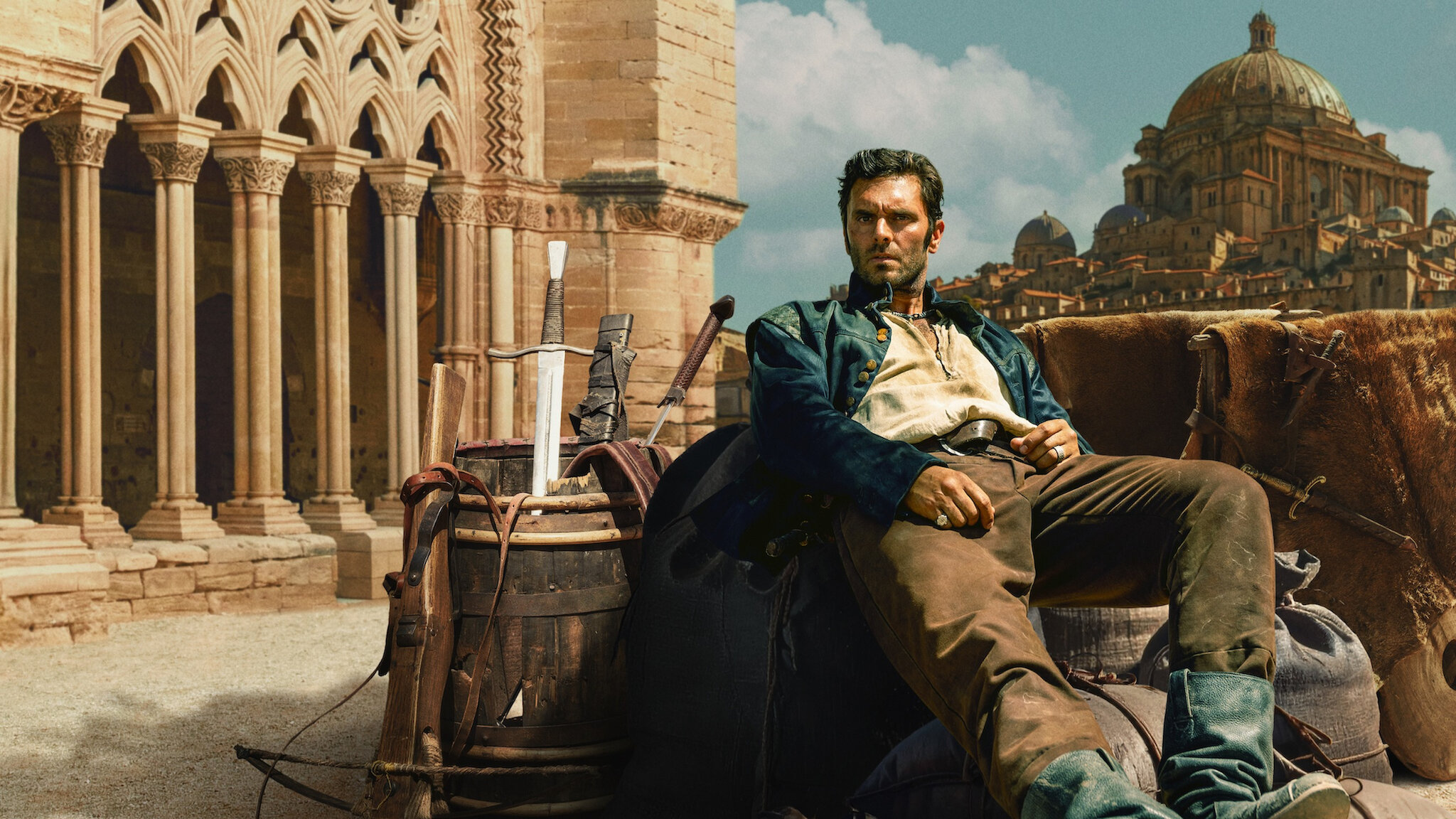
Florine Bel, Color Scientist, talks about collaborating with the DPs, DIT, and VFX teams on Netflix’s new series Néro The Assassin to define and maintain a strong, consistent look across all eight episodes. She dives into the aesthetic choices, LUTs, and color workflow that brought the series’ universe to life.
How did you work with the DPs and Magali Léonard to define the series’ visual identity and create a consistent look across all eight episodes?
NERO has eight episodes, shot by two DPs: Romain Lacourbas for the first four, and Vincent Gallo for the last four. Before shooting, I worked with Romain and Magali Léonard, who graded all eight episodes, to define the series’ overall look. Later, Romain and Vincent coordinated to ensure visual continuity between their respective blocks, reinforced by Magali’s grading work.
I first met Magali and Romain during a screening of camera tests in a period set resembling one of the show’s key locations: a wood-paneled interior with large paned windows and stained glass. These initial tests focused on lighting and lenses; costume tests with the actors came later. Romain explained to Magali and me his vision for the series’ image: strong contrast, rich but contained colors, while respecting the costumes and set design.
We discussed these intentions while reviewing the test footage, trying out initial grading adjustments for saturation and contrast. Magali applied two LUTs Romain had brought and liked for certain aspects. This conversation helped me understand the desired aesthetic universe with concrete examples of what he liked and didn’t. Talking about color over images helped clarify vocabulary, understand his contrast goals, and set saturation limits for the project.
The series planned a main HDR grade, then an SDR version. It was essential to view the lighting tests on an HDR monitor to catch highlight detail and make decisions about how highlights were filtered and affected by the look.
After that, I created LUT-based look proposals and gave them to Magali to test on costume and makeup tests. We reviewed the looks with Romain and chose the ones for NERO: a night look, a sunny day look, a cloudy day look, and an “American night” look. I refined the chosen looks based on feedback from Romain and Magali about contrast and color rendering.
I then handed the finalized looks to DIT Brice Barbier, who applied them on set and gave me feedback if further tweaks were needed. Brice pre-graded the rushes on set according to Romain’s notes, so he could check the look in practice. He then exported the dailies for the editorial team with pre-grading and the look applied.

Which tools, LUTs, or color workflows did you use to make sure the on-set look was preserved in post?
The looks were delivered as LUTs for the Sony Venice 2 camera, so the RAW footage had metadata of the LUT used. Once editing was done, we imported Brice’s on-set pre-grading from Daylight into Baselight for finishing. Using Daylight on set and Baselight for grading allowed full use of Filmlight tools, not just CDL or LUT pre-grades. VFX artists at MPC received a LUT of each shot in the ACES 1.3 workflow, letting them work with the pre-grade even if it significantly altered the colors.
How did you factor in VFX constraints when creating the look, especially for digital or complex shots?
The aesthetic choices weren’t made based on VFX—effects follow the look. However, the look was built in the ACES workflow to preserve full dynamic range before outputting HDR and SDR. NERO’s looks are strong, cool-toned, and compress colors. VFX artists can disable the look to see a neutral ACES 1.3 LUT for color adjustments, then re-enable it to check that the visual effect works with the graded image. This is easy in Nuke and all their tools thanks to OCIO color management.
VFX artists mostly worked in SDR but frequently checked HDR monitors. The ACES 1.3 LUTs for SDR and HDR deliver consistent results from the same image.

Did you experiment with new techniques on NERO that could inspire other post teams?
This project has a strong aesthetic identity. The set, costume, and direction work is remarkable and memorable. Romain Lacourbas’ focus on lighting tests, lenses, filters, sets, costumes, and makeup—something he does on every project—is key to preparing a strong visual identity. These tests allow you to refine the look before shooting. My advice: always find time to do proper tests on every project.
Also, good communication between MPC post, the DIT, and of course Magali and Romain in pre-shoot meetings helped streamline exchanges between set and lab, ensuring grading went smoothly.


